VCS Immigration
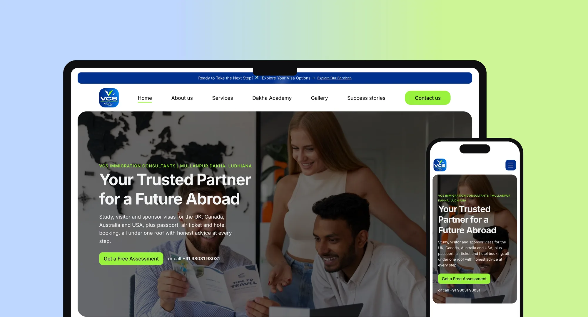
A visa and travel consultancy in Mullanpur Dakha, Ludhiana, and the school support brand it runs from the same office. We built one fast website that gives each offer its own clear path.
(V Consultants & Services)
Responsive build · Interaction design
VCS helps students, families and professionals with visas for the UK, Canada, Australia, the USA and Europe, and Dakha Academy helps students who failed a class avoid losing a year. The site had to present both under one brand and make it easy to get in touch.
The build in numbers
and one script
13 icons combined
or dependencies
1360 to 680 px
The challenge
- Two offers, one brand. Visa consulting and open schooling serve different visitors, so each needed a clear path of its own without splitting the brand.
- A high-trust decision. Visa applications involve money, documents and major life plans, so visitors need to feel confident before they get in touch.
- Mostly mobile moments. Much of the audience needs to reach the office quickly, so calling and WhatsApp had to be easy to reach on a phone.
What we built
| Page | Purpose |
|---|---|
| Home | Hero, service snapshot, why choose VCS, how it works, destinations, Dakha Academy, testimonials, gallery and enquiry form |
| About us | Who VCS is and what it stands for |
| Services | Each visa and travel service in detail |
| Dakha Academy | Admissions page for 10th and +2 through open schooling, with its own FAQ |
| Contact us | Contact details, enquiry form and FAQ |
The details
A mobile menu that gets people in touch
A full-screen brand-blue panel grows out of the menu button, and numbered links slide in one after another. Call, WhatsApp and Email buttons sit at the bottom, so visitors can make contact in one tap from any page.
An endless destinations slider
A cloned set of cards sits on each side of the real ones. Once scrolling settles, the position jumps silently back into the original set, so the slider loops in both directions.
Click-to-play video
The "How it works" section shows a thumbnail with a play button. The video only downloads when someone presses play, so it adds nothing to the initial page load.
Interactions that respect the device
Service card descriptions appear on hover, and stay visible on touch screens that can't hover. The gallery is a draggable marquee on desktop and a simple swipeable row on phones. Testimonial cards open from the keyboard as well as the mouse.
Technical decisions
| Decision | Why |
|---|---|
| No framework or build step | A content-led marketing site doesn't need one. It's simple to host and easy to hand over. |
| WebP images and lazy loading | Images further down the page load only as needed. |
| Structured data on every page | Schema.org business details such as address, phone and hours help search engines understand the business. |
| Reduced-motion support | Animations turn off for visitors who ask their device to reduce motion. |
| Natural text wrapping | Page titles sit in a wider wrapper rather than using forced line breaks, so they reflow cleanly on any screen. |
Problems solved
Clipped hover shadows. The slider's scroll area was cutting off the card shadow on hover. Extra padding, offset by matching negative margins, gave the shadow room without moving the layout.
A menu that opens from a moving button. The announcement bar shifts the header, so the menu button isn't always in the same place. The script now measures its position each time the menu opens, so the animation always starts from the button.
A cleaner mobile screen. The announcement bar took up too much of a phone screen, so it's now hidden on phones and the header sits at the top.