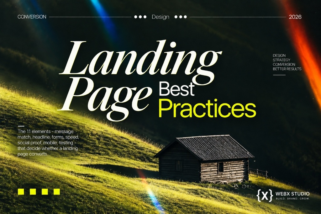
Landing page best practices: the 11 elements every high-converting page shares
Most landing pages don’t fail because the offer is weak. They fail because the page argues with itself — too many messages, too many exits, too much friction between “interested” and “done.” Here’s what the high performers do differently.
Type “landing page best practices” into Google and you’ll find a hundred lists, most of them the same fifteen tips reshuffled. That’s not because the advice is wrong — it’s because a handful of things really do decide whether a page converts, and everyone eventually lands on the same handful. The trouble is knowing which ones matter for your page, in what order, and how far to take each one before you’re just adding clutter.
We build and audit landing pages for founders running paid campaigns, product launches and lead-gen funnels, and the pattern repeats: the pages that convert aren’t the prettiest ones. They’re the ones that make exactly one argument, remove every reason to hesitate, and load before the visitor’s patience runs out. If you’re deciding whether you even need a dedicated page versus sending traffic to your homepage, read landing page vs website: which do you actually need first. If the page already exists and you’re trying to work out why it isn’t converting, this is the checklist we run through.
A high-converting landing page makes one promise to one audience and removes everything — every link, field, distraction and delay — that sits between the click and the conversion.
1. Start with one goal, not eleven
Before a single word of copy gets written, decide the one action this page exists to produce — a booked call, a free trial signup, a download, a purchase. Not three actions with equal billing. One. Every element on the page should earn its place by moving the visitor toward that single outcome; anything that doesn’t is a distraction, however useful it feels. This is the single biggest structural difference between a landing page and a normal website page, and it’s worth deciding on paper before you open a design tool.
2. Match the message, or lose the click
The headline visitors see on your page should feel like a continuation of the ad, email or search result they just clicked — same promise, same language, same offer. When the page says something even slightly different, the brain registers a mismatch and the instinct is to leave, not to read further and reconcile it. Message match is unglamorous, invisible when done right, and one of the most reliable levers for lifting conversion rate without touching design at all.
3. Lead with a benefit, not a slogan
A landing page headline has one job: answer “what do I get, and why should I care” in under two seconds. Clever wordplay and brand slogans lose to plain, specific benefit statements almost every time on a page whose only visitors are people who already clicked something to get there — they’re primed for the payoff, not a puzzle. Write the honest version of what you offer first; polish the wording after, without losing the clarity.
4. Make the top of the page do the work
Everything a visitor needs to decide “this is for me” — headline, one supporting line, a visual, and the primary call to action — should be visible without scrolling, on mobile as well as desktop. Below that, visual hierarchy should guide the eye in one direction: headline, supporting proof, then the button, with size, colour and whitespace doing the steering rather than the visitor having to hunt. The call to action should be the most visually prominent thing on the page — not the logo, not a hero photo, not a navigation bar you probably shouldn’t have included at all.
5. Prove it before they scroll past
Claims are cheap; proof is what actually reduces hesitation. Testimonials, client logos, review counts or a short case study all do the same job — they tell a sceptical visitor that people like them already took the risk and it worked out. Placement matters as much as the proof itself: put it near the headline for a first-impression lift, and repeat it near the form or button, right where hesitation peaks and a visitor is deciding whether to commit.
| Element | Job on the page | Quick way to check it |
|---|---|---|
| Single goal | Keeps every element pointed at one action | Can you name the one action in a sentence? |
| Message match | Continues the promise from the ad or link | Same headline language as the ad? |
| Headline | States the benefit in under two seconds | Read it aloud — is the payoff obvious? |
| Hero clarity | Shows the offer without scrolling | Screenshot above the fold on mobile |
| Social proof | Removes doubt near decision points | Is proof visible near the CTA, not just the top? |
| Form friction | Keeps the ask smaller than the offer | Could any field be removed or asked later? |
| Load speed | Keeps impatient visitors from leaving early | Test on a real phone, not just Wi-Fi |
| Mobile layout | Works for the majority of your traffic | Are buttons thumb-sized and spaced out? |
| Visual hierarchy | Directs the eye toward the CTA | Is the button the most prominent element? |
| Single CTA | Avoids competing choices | Does every button lead to the same action? |
| Testing | Turns opinion into evidence over time | Is anything currently being A/B tested? |
6. Every form field is a small tax on intent
A form is the last obstacle between interest and conversion, and each additional field is a small toll the visitor has to decide is worth paying. Ask for what you genuinely need to follow up well, and defer everything else to a later step in the relationship — a qualifying call, an onboarding form, a CRM enrichment tool. Cutting a form down to the essentials is consistently one of the cheapest, fastest wins available on an underperforming page; we cover the maths behind this, and the other levers that move conversion rate, in what actually moves your landing page conversion rate.
- Ask only for what you’ll genuinely use in the first follow-up.
- Use a single, benefit-driven button label — not a generic “Submit.”
- Repeat the same CTA at the top and bottom of a longer page, worded identically.
- Remove the main navigation menu; a landing page shouldn’t offer an exit route.
- Show what happens immediately after the click — a confirmation, a next step, a timeframe.
The page that converts best is rarely the most creative one. It’s the one with the fewest reasons left to say no.
7. Speed and Core Web Vitals decide who even sees your headline
None of the above matters if the page hasn’t finished loading by the time an impatient visitor gives up and hits back. Paid traffic is especially unforgiving here — you’ve already paid for the click, and a slow page burns that spend for nothing. Compress images, defer anything non-essential, and keep the page as close to a single clean layout as possible rather than a stack of heavy scripts and widgets. We go deeper on why this affects both conversions and rankings in Core Web Vitals: how site speed decides ranking.
8. Design for the thumb, then test everything
For most campaigns, mobile is where the majority of clicks land, so the mobile layout isn’t a scaled-down version of the desktop page — it’s the primary design, with the desktop version adapted from it. Buttons need real tap targets, forms need to work with an on-screen keyboard without hiding the field being filled, and the whole page needs to feel deliberate on a small screen, not squeezed. Once the fundamentals above are in place, stop guessing and start testing — one headline against another, one CTA wording against another, one form length against another. Change a single variable at a time, give it enough traffic to mean something, and let the data settle arguments that opinions never will.
Want a second pair of eyes on your landing page?
Send us the link. We’ll tell you honestly what’s costing you conversions — and what to fix first.
Start a project